Palette and Typography
Essential Color Palette Resources for Designers
Five go-to resources for palette curation and color systems: CoolHue, Color Hunt, Adobe Color, Coolors, and ColorSpace, along with the distinct advantage of each.
For designers
4min read
·

Color fundamentally shapes the final output of any design. Designers rely on precise tools and platforms to streamline this process. Here are key resources to guide and elevate your color curation workflow.
CoolHue
A well-curated collection of balanced color gradients. It features dedicated plugins for Figma and Sketch to support digital product and web design workflows.
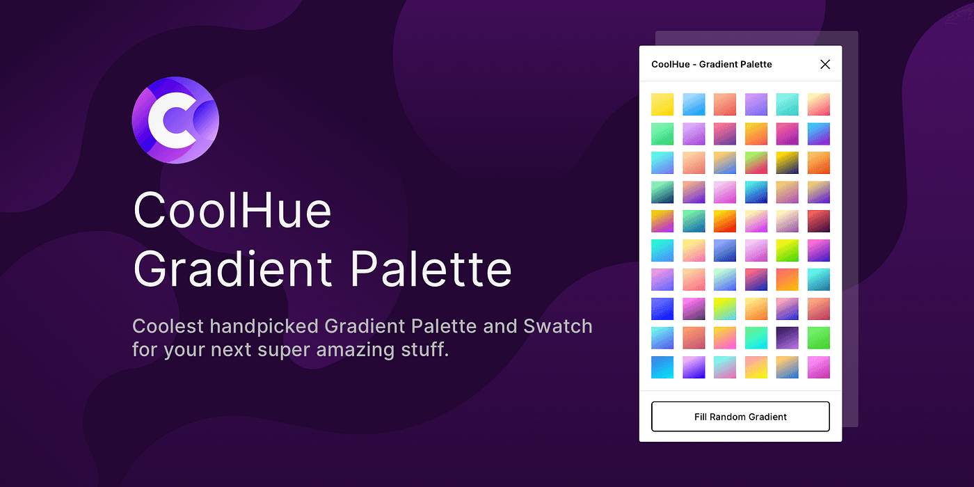
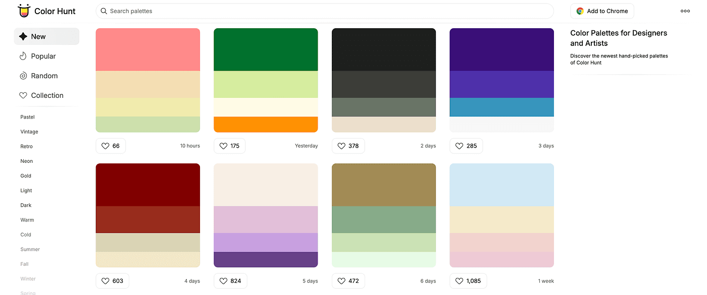
2. Color Hunt
Curated palettes organized by tone and theme, offering balanced color combinations ready for application.
Includes a Google Chrome extension.
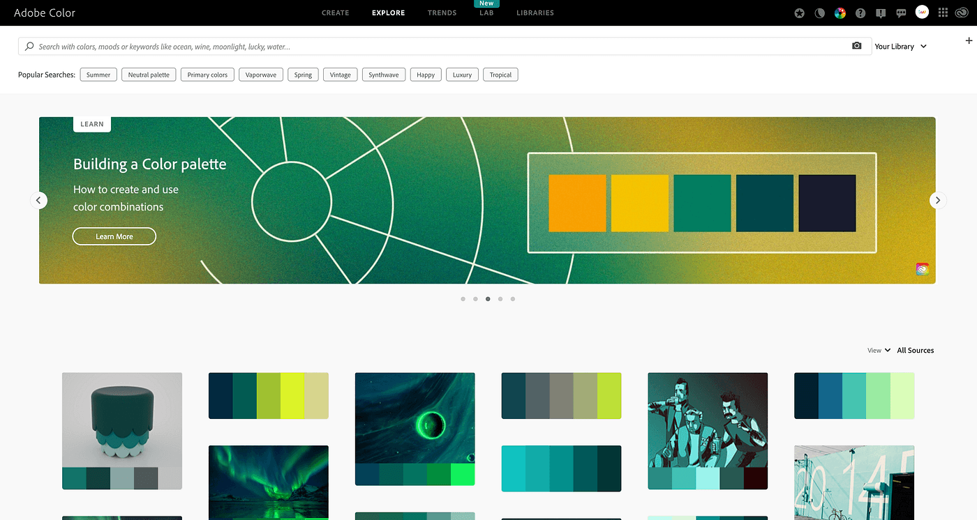
3. Adobe Color
An Adobe ecosystem platform offering comprehensive palette controls and native integration directly within Creative Cloud applications. Its AI capabilities include intelligent recoloring for vector artwork.
*Also available as a mobile application.
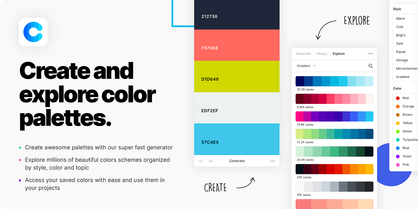
4. Coolors
A powerful, essential platform for comprehensive color systems. It enables theme-based selection, community palette exploration, and direct image color extraction. Extensions across major browsers and design software allow for a seamless in-app workflow.
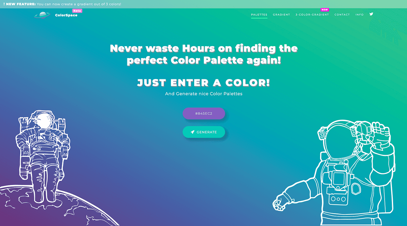
5. Colorspace
A utility that generates systematic color rules and palettes anchored in color theory from a single selected base color. It provides a structured, practical approach for building out coordinated variants.
Building a Complete Brand System Palette
While these platforms offer valuable exploration, building an identity system differs fundamentally from designing a single asset. A brand identity must perform consistently across applications for years, requiring clear rules rather than subjective preference.
Start with Positioning: Define three core attributes that capture the brand personality before opening any tool. The palette must reinforce these terms.
Assign Clear Hierarchy: Establish a primary brand color, functional neutrals for typography and backgrounds, and one or two accent colors for targeted emphasis. Robust brand systems rely on discipline and restraint.
Test for Contrast: Legibility is paramount. Comply with WCAG guidelines by ensuring at least a 4.5:1 contrast ratio for standard body text, using built-in testing tools.
Validate in Context: Test palettes directly on real-world applications—business collateral, digital interfaces, packaging, and editorial assets. A palette that works on a swatch card may fail at scale.
Document Color Values: Record precise values across all production environments: digital (HEX, RGB) and print (CMYK, Pantone). Consistency requires exact cross-medium translation.
Structured Palette Workflow
Inspiration: Explore Color Hunt and CoolHue to assess directional trends rather than directly importing pre-made sets.
Construction: Use Coolors to generate iterations anchored to your primary hue, locking down core tones and refining supporting colors.
Harmony: Apply Adobe Color to align with systematic color wheel relationships—complementary or analogous—to validate harmony and logic.
Extension: Use Colorspace to extract precise tint and shade scales for varied UI states and background surfaces.
Common Strategic Pitfalls
Selecting colors based on short-lived trends rather than core brand positioning.
Diluting visual equity by relying on too many competing primary colors.
Failing to account for dark mode variants and cross-display calibration.
Overlooking typographic rendering, particularly for fine weights and compact text sizes in Arabic typography.
Conclusion
Digital tools optimize workflow efficiency, but strategic clarity directs the outcome. Ground your palette in brand positioning, define disciplined functional roles, and validate thoroughly across real-world environments before final deployment.